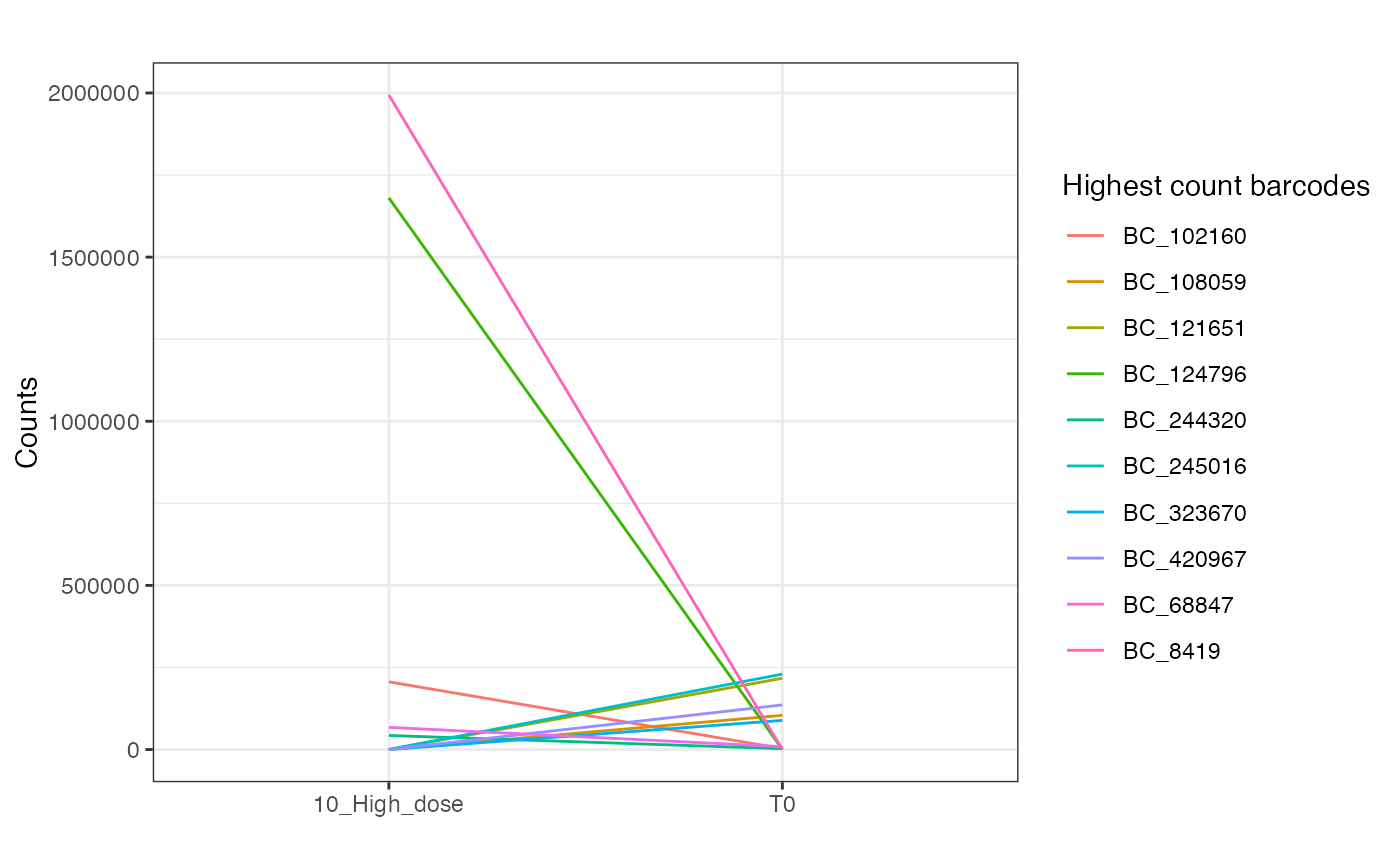
Lineplot of barcode abundances in two conditions
plotAbundanceLines.RdTakes a dataframe of barcode counts, computes the median abundance of each barcode for two specific conditions, then do a line plot for both conditions
Usage
plotAbundanceLines(
  dgeObject,
  group,
  conditions,
  plotType = "DEG",
  keep = 0.9,
  nBarcodes = 10,
  title = ""
)
Arguments
- dgeObject
DGEList object with barcode counts.
- group
Column name in sample metadata to group samples by (string).
- conditions
Names of 2 conditions in group column to compare (vector of strings).
- plotType
(string) `DEG` plots the 10 most differentially abundant barcodes. `counts` plots the 5 top highest abundant barcodes for each condition. `log2FC` plots the barcodes with the highest absolute log2FC (number of barcodes to plot is given by nBarcodes). Default = `DEG`.
- keep
percentage of highest abundant barcode to keep (decimal). Rest of barcodes is filtered and not used in plots. Default = `0.9`.
- nBarcodes
Number of barcodes to plot when using 'log2FC' plot type (integer). Default = `10`.
- title
Optional, plot title (string).